
Delta Air Lines remains a favourite among many, boasting a large base of loyal clients. All "SkyMiles" members are encouraged to download the Fly Delta app, a tool providing passengers with multiple travel-related functions right from their smartphones.
In this exercise, I attempted to revamp some aspects of the app's interface, improving some existing user flows and including some novel features. I also include an AI assistant idea for the app. Click here to play the Figma Prototype.

Study what enhances customer engagement and brand loyalty

Tweak flows and designs for more meaningful interactions

Integrate AI component to stay industry-forward
Jump to Reasoning
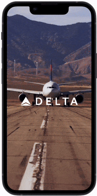
Landing Page
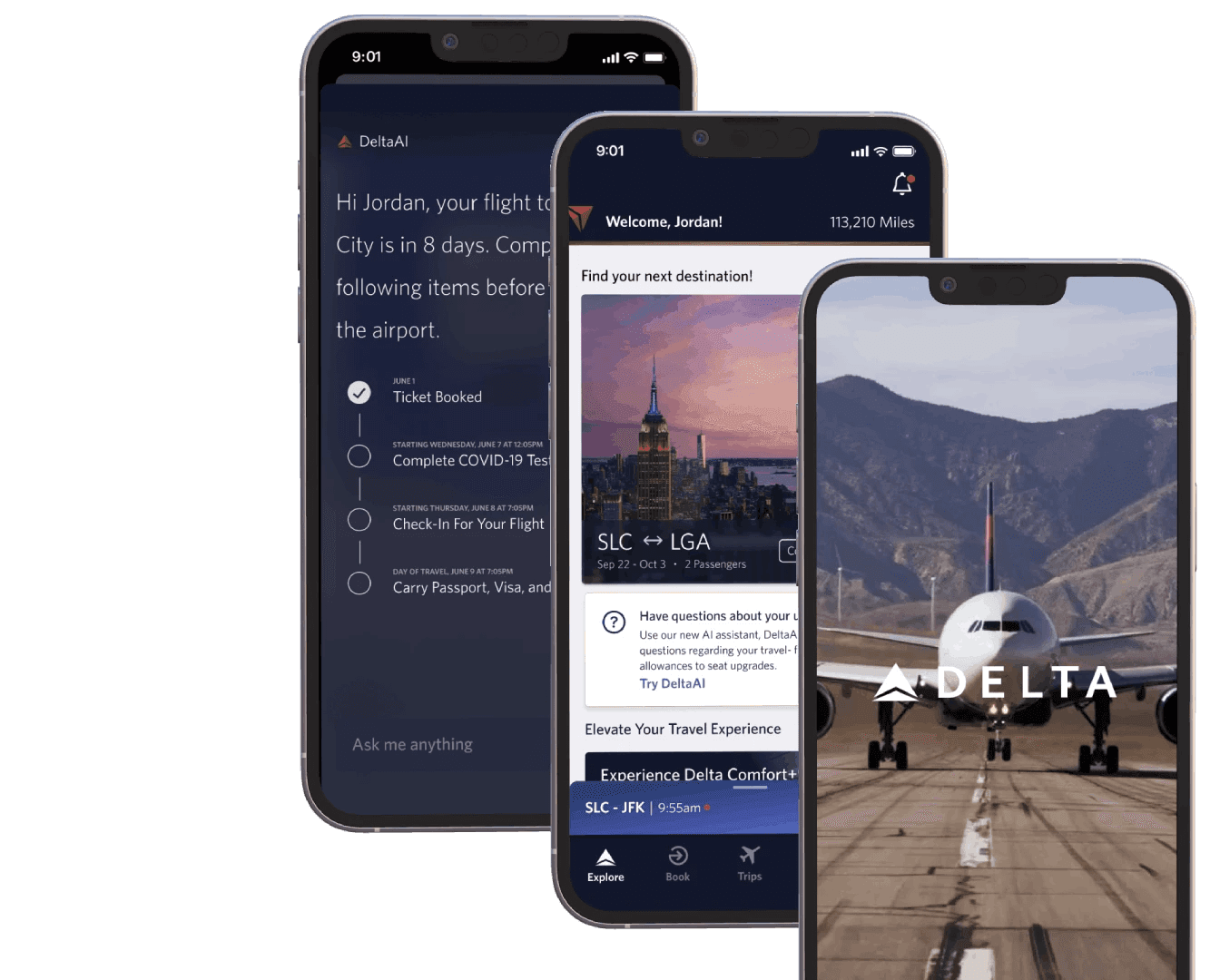
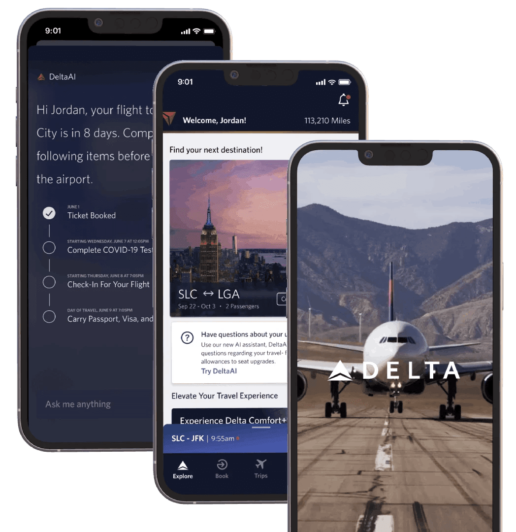
I chose a dramatic visual for the loading screen to engage users and elicit marvel. This leads directly into a personalized greeting, helping to build trust. It then pulls up the main Trips page.
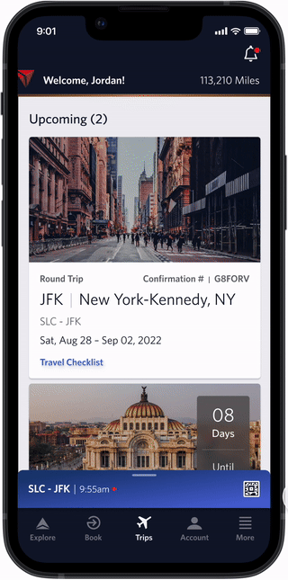
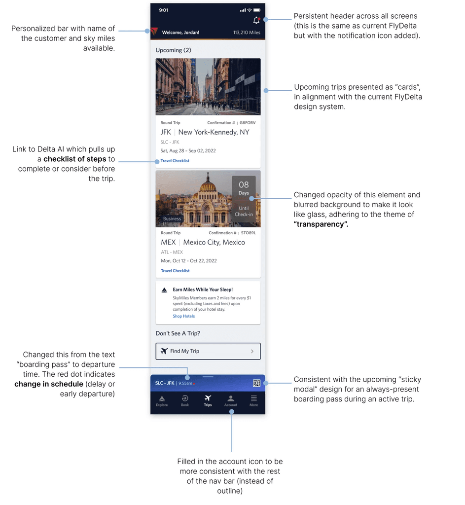
Trips Page
The trips page displays card for upcoming trips. It also has the standard navigation bar at the bottom and a "sticky" boarding pass right above that for any active trips.

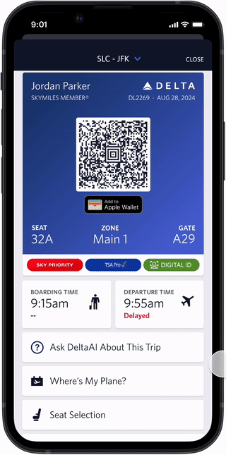
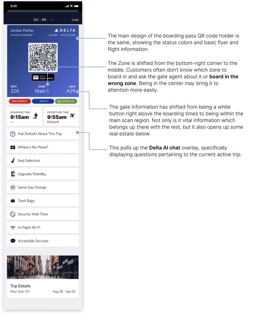
Boarding Pass
The sticky boarding pass allows users to always be 1 click away from viewing present trip details. The boarding pass opens up in a standard iOS modal.
Explore Page
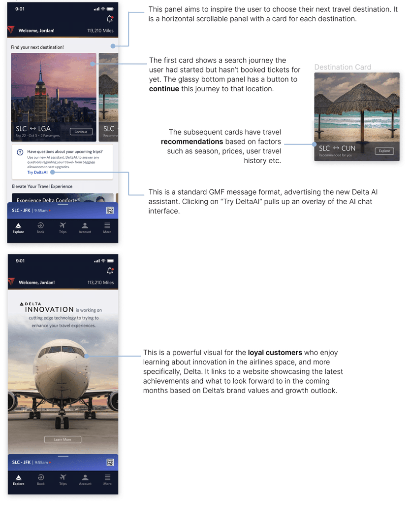
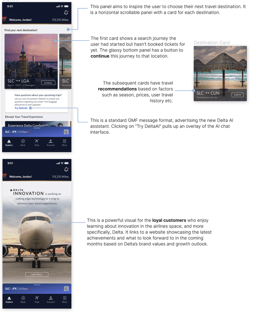
Switching to the explore page through the navigation bar pulls up the "Find your next destination" section. This features large visual cards for custom recommended destinations.


Explore Delta
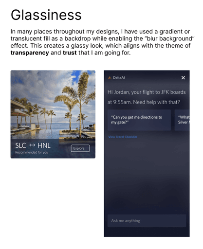
Transparency is a theme I explore throughout my designs. These little tidbits of information enable customers to actively participate in witnessing the company's growth and nurturing efforts.
Delta AI
I wanted to visualize the use of an AI digital assitant that gives natural language answers, and also provides a travel checklist catered to the passenger. The Delta AI feature can be called from the boarding pass or the Explore page.
I started my ideation for redesigning by looking at other airline app screens I found online as a comparative study. I used these as inspiration, studying which features worked well and which ones didn't.
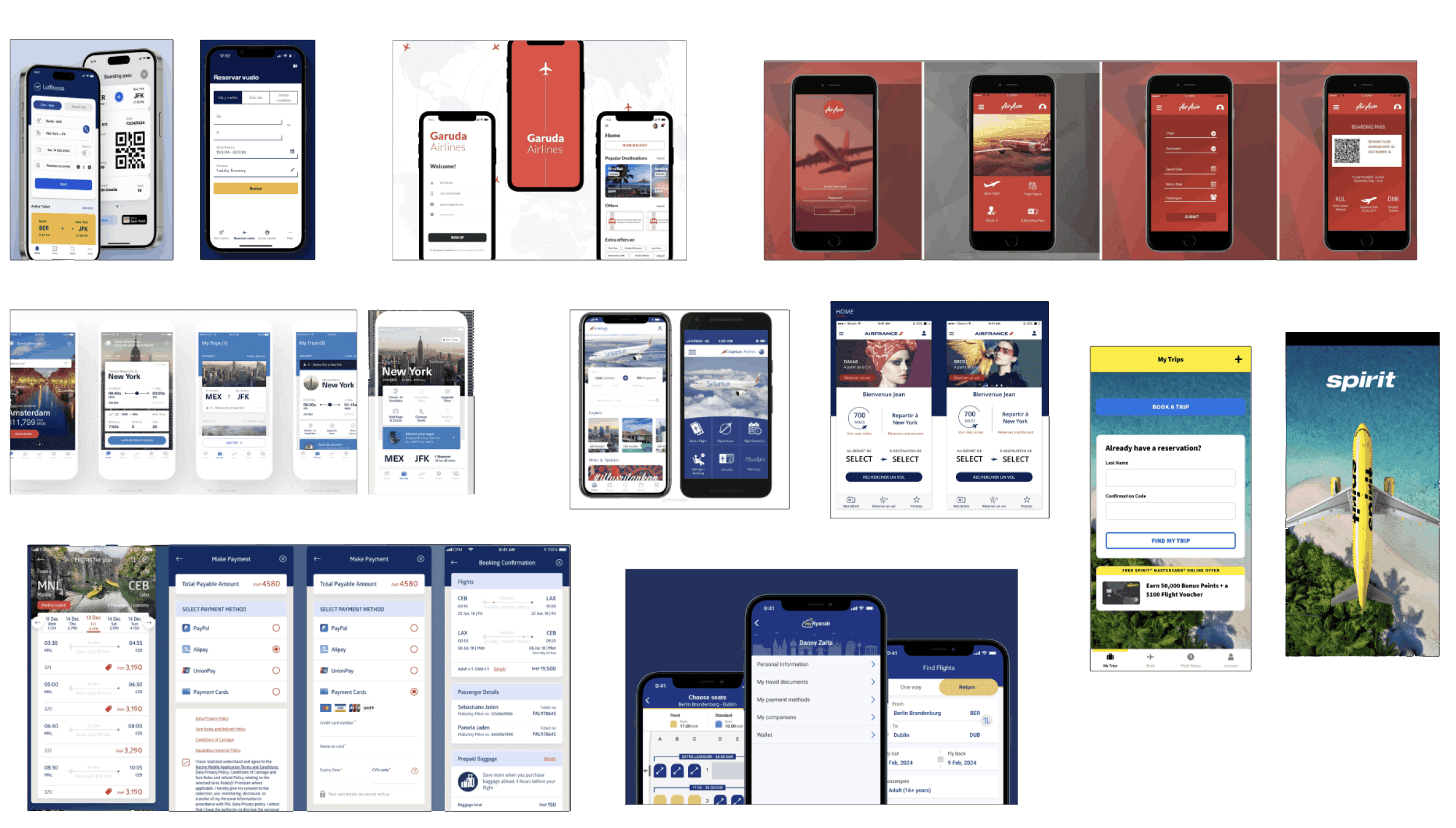
Key gaps and observations
A large landing visual draws attention and inspires awe
Gate information should be easily visible and accessible
Using engaging hero images for destinations increases chances of clicks
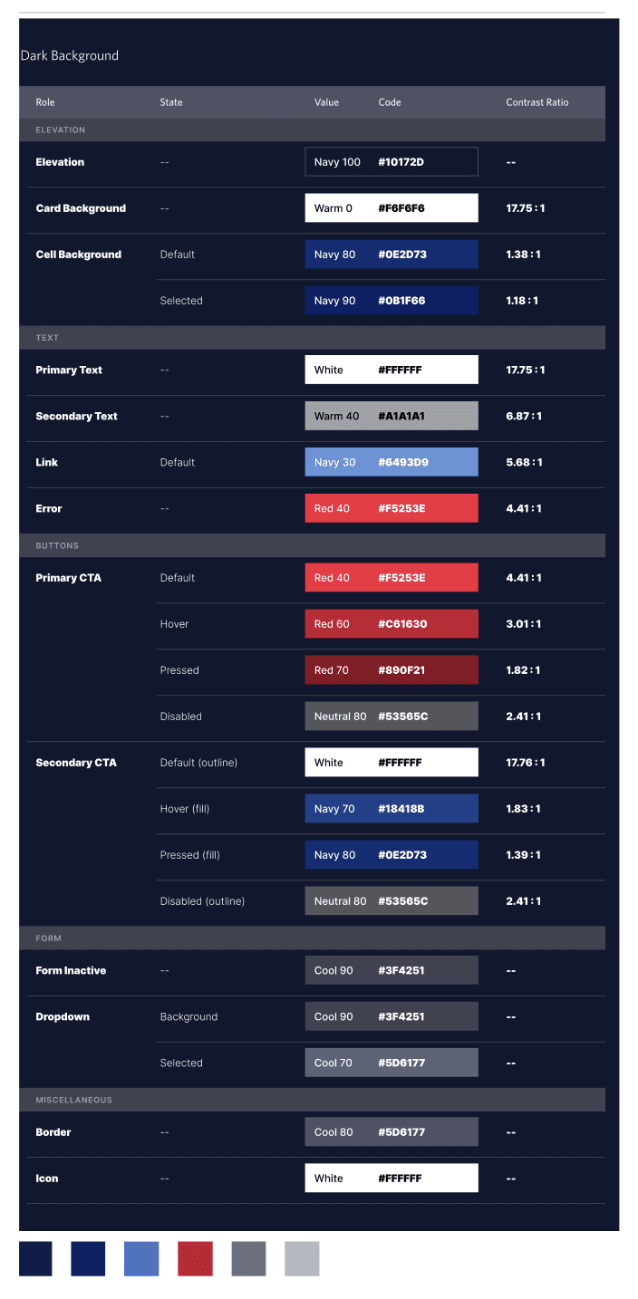
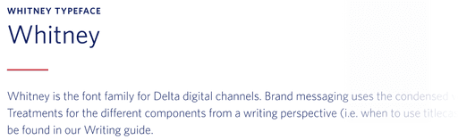
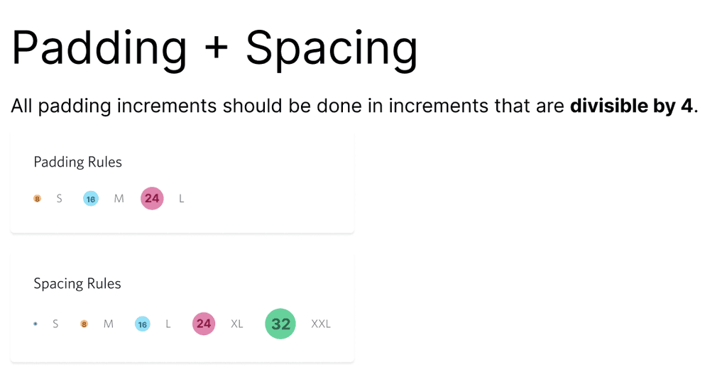
Design System: Familiarity and Trustworthiness
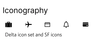
I adhere to the Delta design systems by using their signature colours, iconography, component styles, and typography. I then took some liberties with certain gradients and interactions.
Boarding Pass
Trips Page
Explore Page
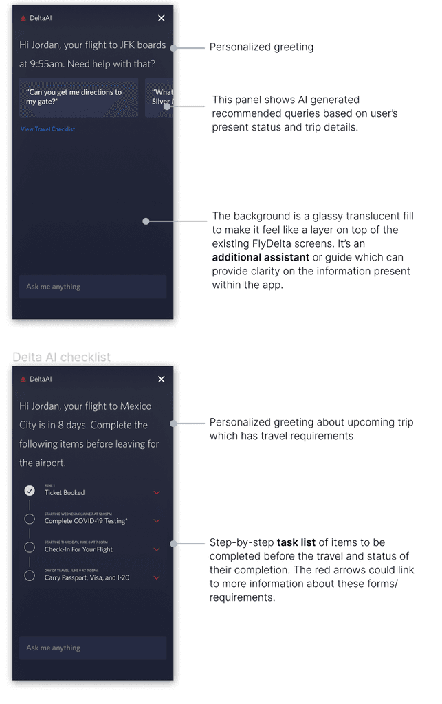
The AI screens show how we can reduce the load on reservations agents by automating assistance.
The Explore Delta page led to a new project for showcasing innovative initiatives on the app to adhere with Delta's principles of customer engagement and loyalty.
Redesigning the trips page, explore page and boarding page for a more frictionless customer journey.